Tea India: a new, vibrant look for Tea India and their fresh blends

The brief
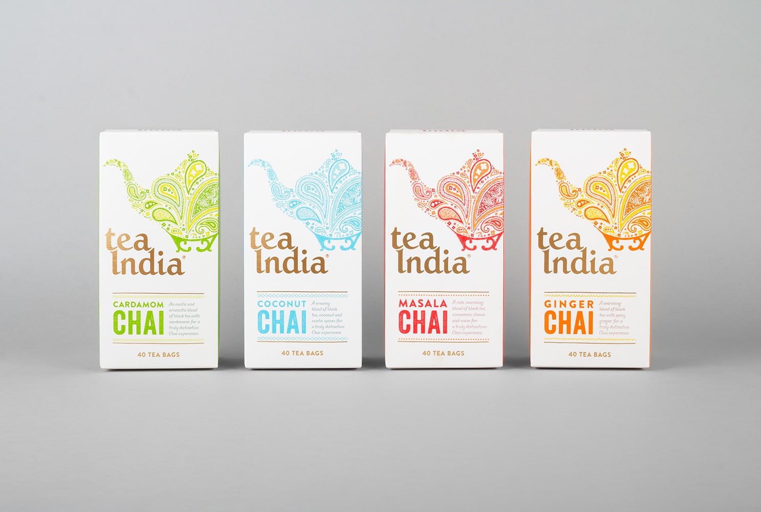
Having developed two new flavours to add to the range, Tea India decided that it was time to develop their brand, revisit their packaging designs and better equip the brand to compete in an increasingly competitive market.
As chai originated on the streets of India, the brief was to create a more evocative aesthetic that both captured the atmosphere of that environment and communicated the flavours within.
The solution
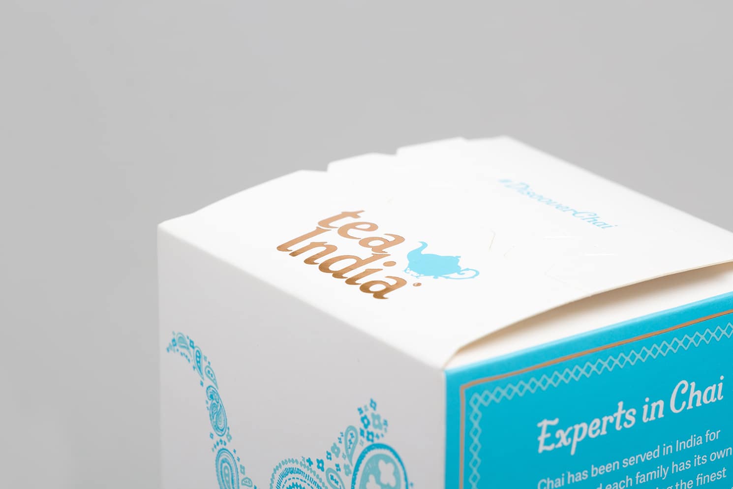
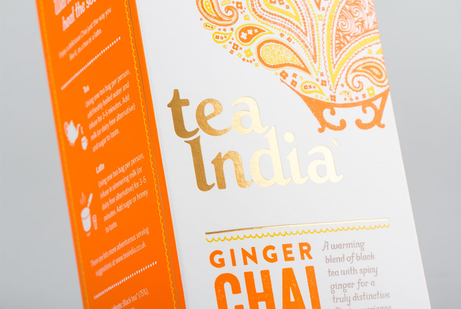
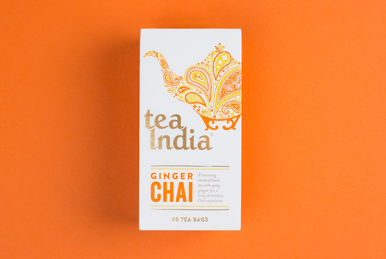
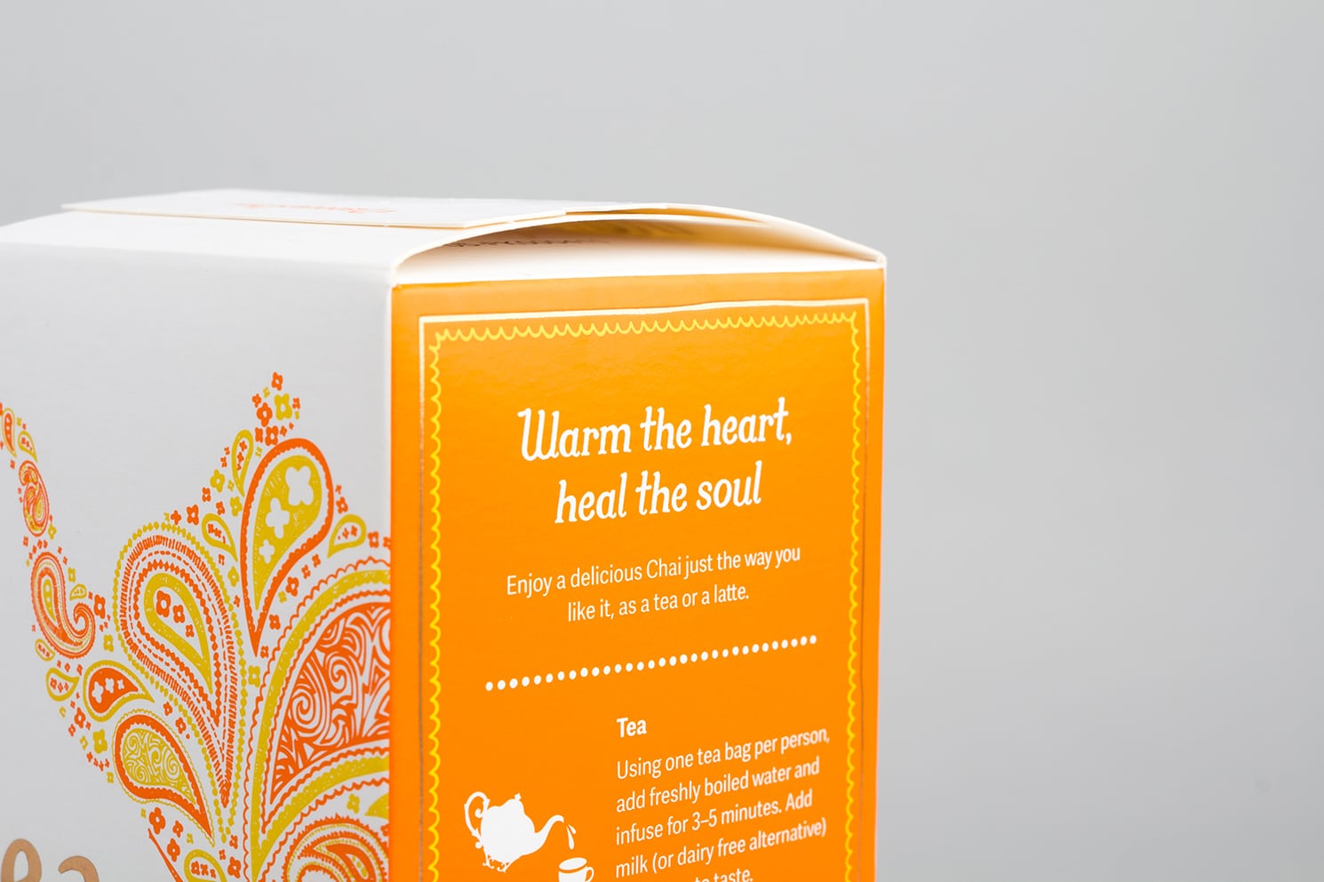
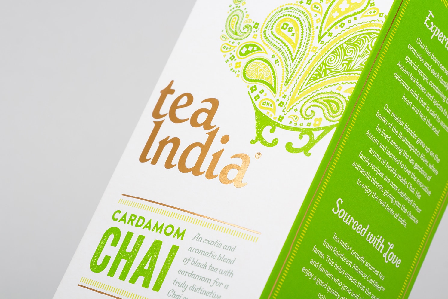
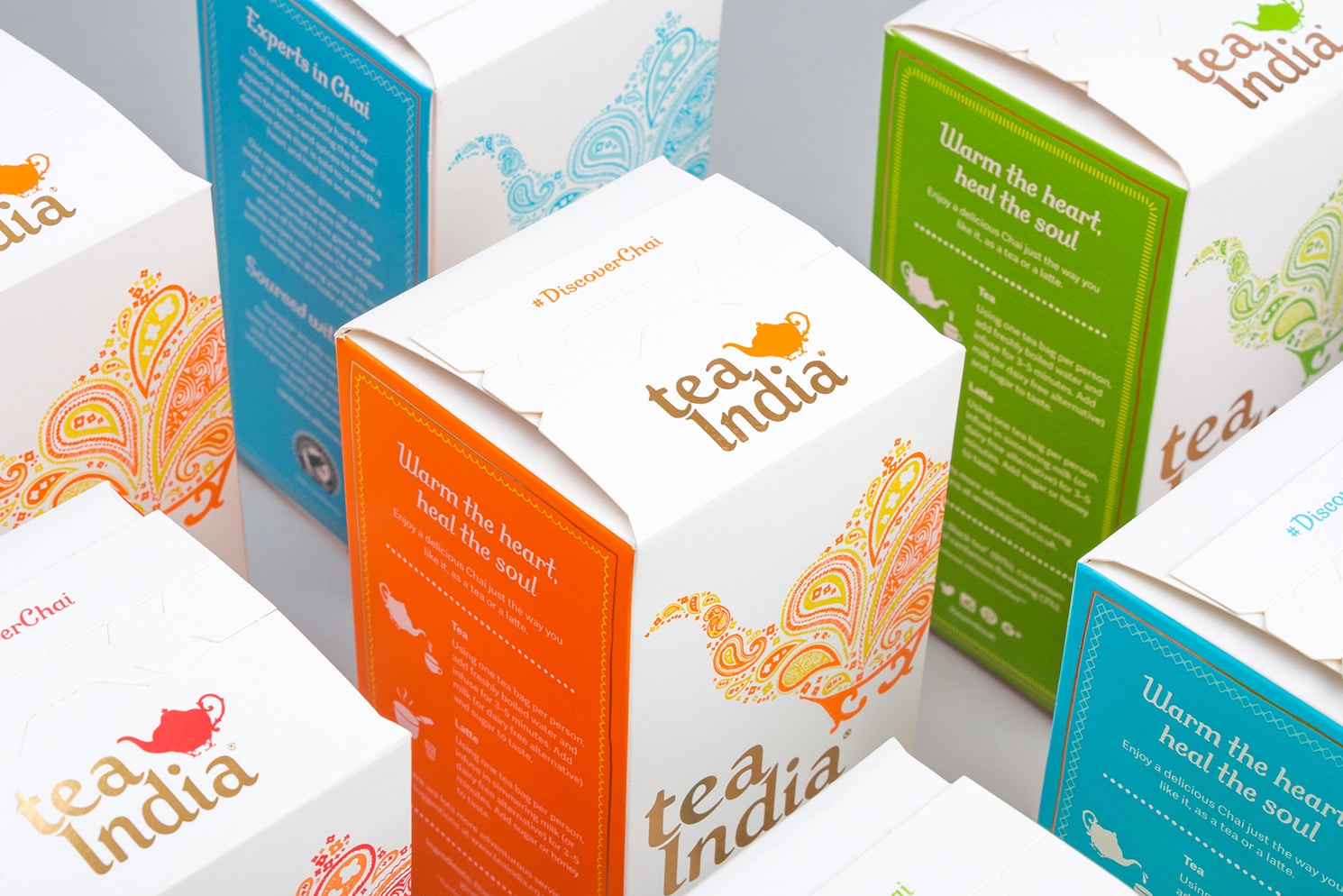
A deep, heavy blue dominated the previous pack designs. We started by stripping this out and replacing it with a much lighter background colour which gives the packaging a much cleaner and fresher feel.
Inspired by an eclectic mix of Indian sign and language writing styles, we created a collection of textured fonts and hand drawn graphics. When combined with a vibrant colour palette, these elements produce a contemporary aesthetic which also reinforces the provenance of the product.
The results
The new look has helped to drive listings of the products. Tesco and Sainsbury’s are now stocking the new Tea India Masala Chai in over 1200 stores and Waitrose have also now agreed to stock the Masala Chai and Coconut Chai products in over 290 stores.
The designs have been really well received by the North American market so a roll-out stateside is planned over the coming months. Watch this space…
“A big thank you to the team at Salad – the new packaging looks amazing and we are thrilled that nearly the entire Waitrose estate will be stocking our teas.
This project demonstrates a great team effort so thank you all for making the expansion of the Tea India brand possible.”